


👋 Hey there, I’m Lenny. Each week, I share deeply researched product, growth, and career advice. For more: Lenny’s Jobs | Lenny’s Podcast | Lennybot | How I AI | Become an AI-Native Builder and my other favorite AI/PM courses
P.S. Get a full free year of Cursor, Notion, Replit, Lovable, Wispr Flow, Linear, ElevenLabs, Factory, PostHog, Granola, Brain.fm, Waking Up, and more, by becoming an Insider subscriber (while supplies last). Learn more.
I’d always thought AI was bad at design. But after reading this mind-blowing post by Anshu Chimala, I realize I was just doing it wrong. Anshu led software engineering and design teams at Apple for 12 years, focusing on research and prototyping for future AI products. He regularly shares design tutorials and demos on X (he’s one of my favorite follows). For deeper dives into crafting distinctive experiences with AI, check out his Substack and connect with him on LinkedIn.
Let’s get into it.
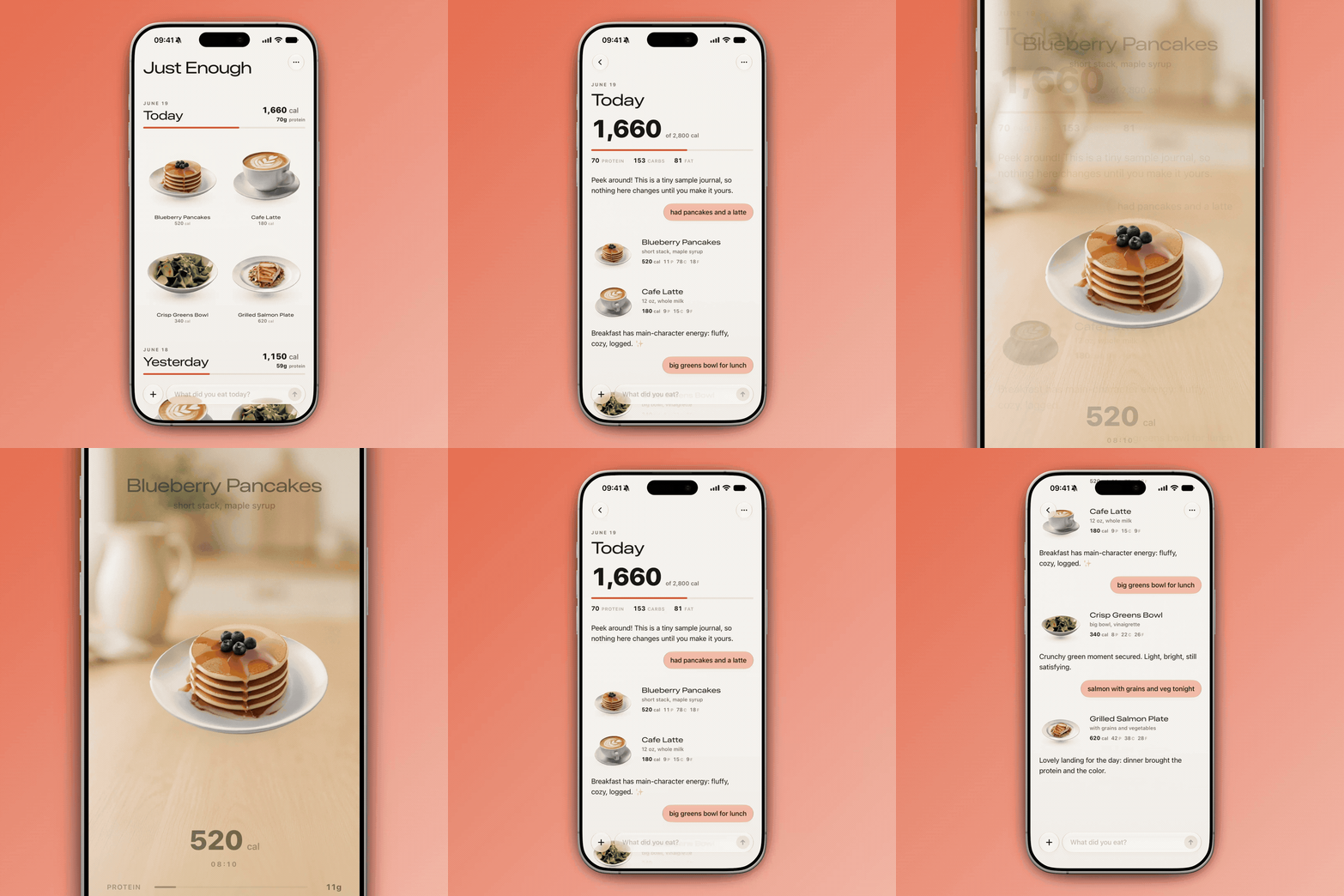
A conversational calorie tracker, built in three prompts with Claude Fable 5:
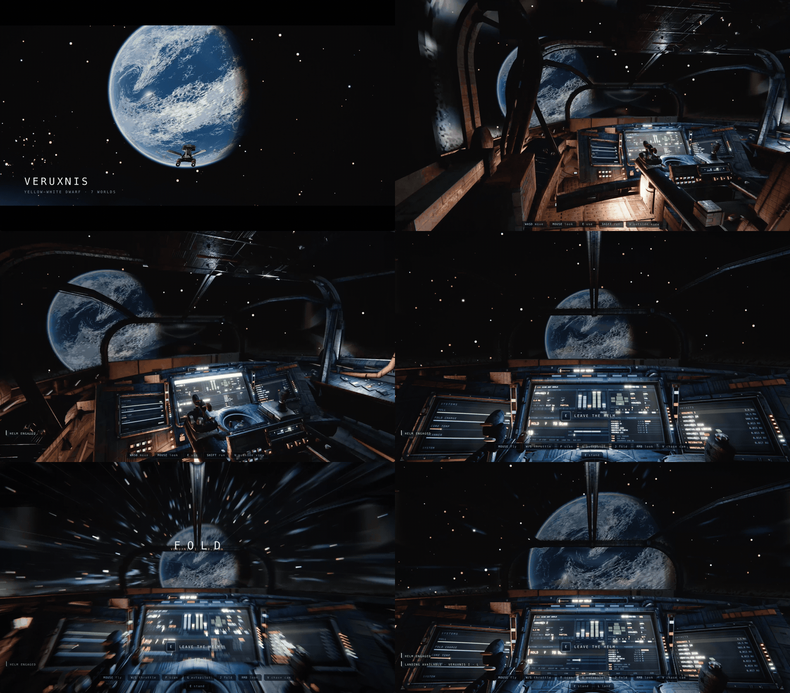
A space exploration game, built in two prompts with Claude Opus 5:
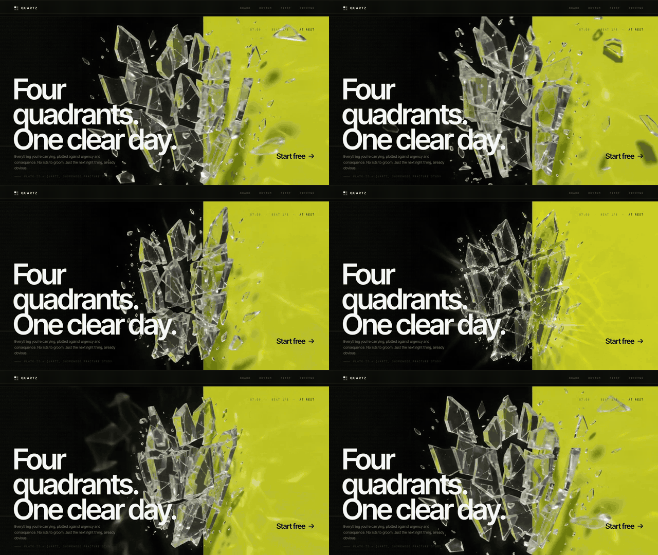
A dynamic landing page, built in three prompts with Claude Opus 5 + GPT-5.6 Sol:
I often post AI design demos like these on X. Every time I do, someone inevitably asks, “Why does the model create all this incredible stuff for you, but when I try, I only get generic slop? It’s like you’re using a completely different model.”
I’m not using a different model, but I am getting more out of the models I work with. Most people only see 1% of AI’s creative potential. I want to show you how to tap into the other 99%.
AI models are capable of amazing creativity, but that creativity gets stifled by how they’re trained. Large language models are next-token predictors: at each step, they look at a sequence of text and predict what comes next based on millions of examples. The results may be rated by humans, and those ratings fed back into the model. This teaches the model to make consistent, safe choices that fit everyone’s preferences.
This makes typical LLMs great at most tasks but poor designers. To create a design, an LLM has to build it out token by token. Whenever it needs to make a design decision—what colors to use, or how to arrange elements—the model fills in the tokens it thinks are most likely to please everyone. As a result, the design usually ends up being repetitive and bland. It’s like the ultimate case of design-by-committee.
Great design, on the other hand, starts with feeling and aims to create an emotional response. It bends the rules and delights users with memorable, unexpected choices. Great design is exactly the opposite of what an LLM does naturally, which is to make the most predictable choice at every step.
However, if we can get the model to reach beyond the most predictable choices, we can access a vast landscape of creative ideas that most people miss out on.
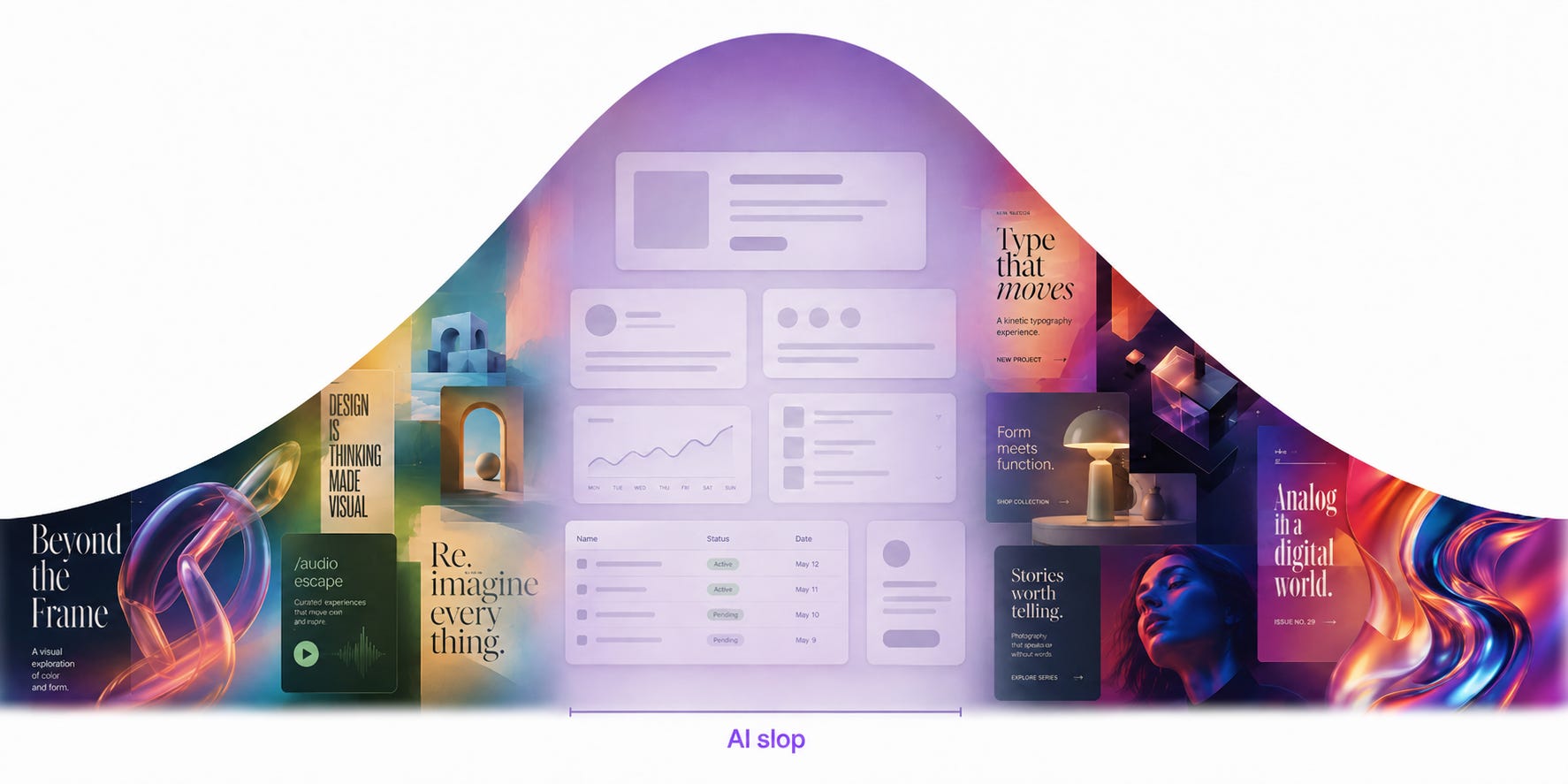
This is a lesson I learned from managing human designers, before I was managing AI ones. For most of my career at Apple, I led an R&D team designing exploratory future AI products. Early on, our preconceived notions about how user interfaces should work limited our creativity and kept us returning to the same old ideas. Through rigor and new processes, we learned to stop re-creating what’s comfortable and instead look to the fringes of what’s possible, to generate something new. We became experts at polishing the little details to an Apple level of quality.
Since my time at Apple, I’ve been working on applying that same process to my work with AI. In the past couple years, AI agents have become extremely capable. They can do in hours what used to take my team weeks. And with the right guidance, they can create designs that look completely unlike anything else.
Loosely inspired by the Double Diamond design process, I’ve reimagined the design process for a team of AI agents instead of human designers:
Discover new ideas beyond the average slop by exploring a variety of directions and creating bold, ambitious design briefs.
Define an individual design identity by pushing AI beyond its familiar patterns and chaining models together to fully realize the design’s potential.
Deliver a stunning final result by polishing away the sloppy rough edges and focusing on the key elements.
By following these stages and applying the techniques within each one, you can create an incredible design remarkably quickly—and make people ask, “Why does AI create magic for you (and not me)?”
Discover: Explore the space of possibilities
The hardest part of the design process is looking at a blank screen with infinite possibilities. The best way to tackle that moment is to start by going broad before going deep. AI is an excellent tool to explore a wide variety of potential directions.
As we know, though, models tend to overrely on familiar patterns and make conservative choices. To explore the full potential design space, we want to coax a model to do the opposite: be bold, be varied, and take risks. Below are two ways to push it out of its comfort zone.
Technique 1: Use seed strings to inject variety
The idea here is to get the model to find a new source of inspiration for designs, rather than relying on the defaults it learned from training. If you’ve tried to prompt a model to design a website or app, you’ve probably already seen what that default looks like.
As a simple example, I gave four instances of Claude Code the same prompt:
Prompt:
Build me a landing page for my productivity app.
Claude Opus 5:
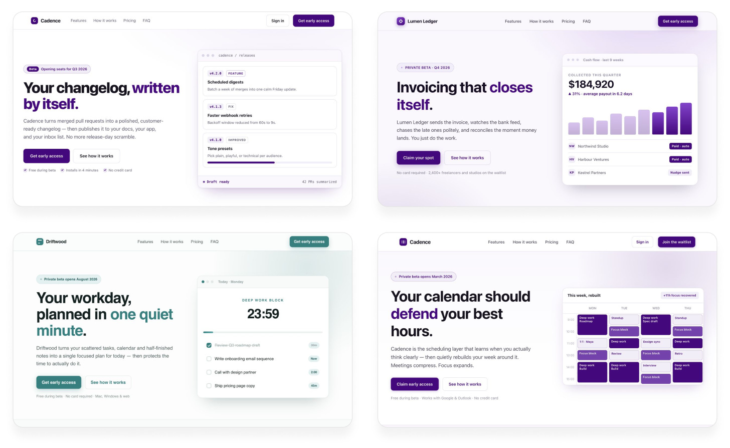
Almost every time, we get a purplish gradient, text on the left, graphic on the right, and the exact same structure. It looks like every AI-designed website ever.
We didn’t ask the model to do anything unique or varied, so it makes sense that it keeps falling back on the same patterns it knows well. But just asking for variety doesn’t work:
Prompt:
Build me a landing page for my productivity app. Give me something totally unique. Make every design decision completely at random.
Claude Opus 5:
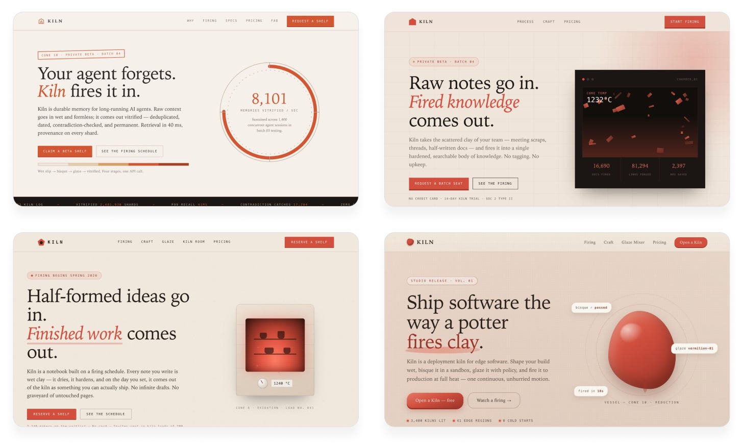
The results are different from before, but they’re still not varied. The model always uses the same color scheme, structure, and even the same awkward pottery metaphors. It’s predicting tokens that sound random but aren’t actually random.
The problem is that the model can’t inherently act randomly. It can only predict the most likely token. If we want variety, we have to bring it from outside the model. One technique for this is String Seed of Thought, published by Sakana AI. We make the AI generate a random string and use it as design inspiration. That way, the model is truly making different decisions each time.
Prompt:
I want you to build me a landing page for my productivity app.
Follow this procedure:
Generate a long, random alphanumeric string using a shell script.
Define the creative direction (color scheme, layout, typography, etc.) based on the string. Look beyond the surface for subpatterns, special numbers, anything that inspires you.
Use your judgment to bring this direction to life and make it look great.
Don’t reveal the string in the design. It’s only for your inspiration.
Claude Opus 5:
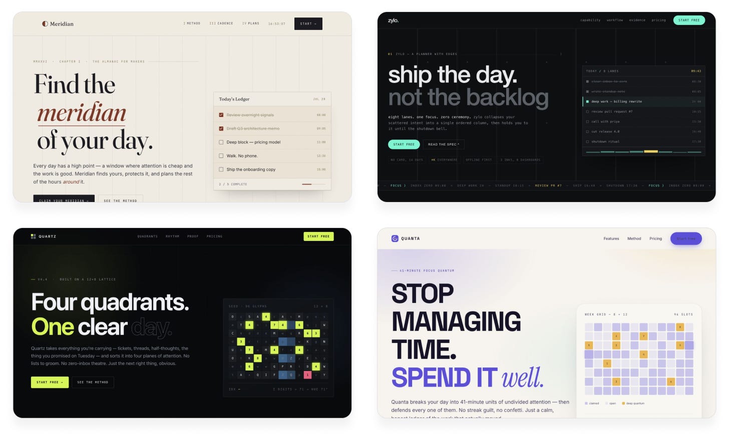
Suddenly the outputs are much more varied! Now we’re seeing different color schemes, fonts, and new ideas. The previous designs were ones that any Claude user could get. These designs are one-of-a-kind; no two runs ever produce the same result.
Technique 2: Be much more ambitious with your prompts
Another approach to giving a model a strong push is to get more specific and wild with your prompts. This gives the model a clear vision to base its decisions on, rather than letting it make them up on the fly. The best way to find a unique idea is by bringing your own taste into the equation. You first imagine the inspiration—a video game, an interior design trend, an art installation—and describe how you’d like that inspiration to influence the AI’s outputs. Here are some examples:
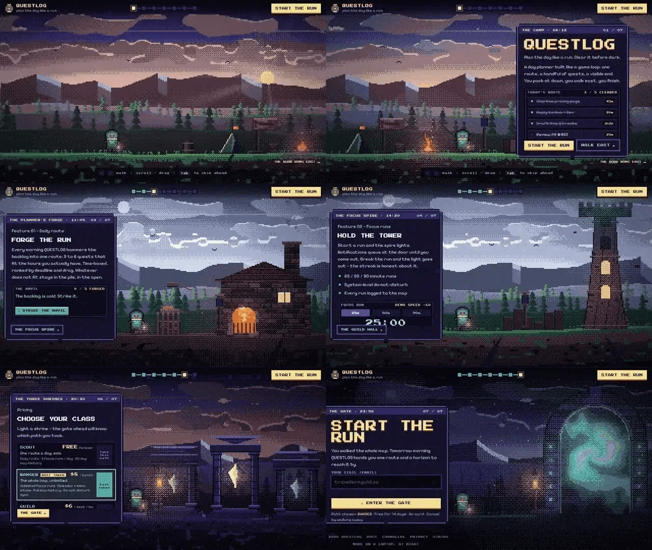
“Build me a landing page for my productivity app, with a bold pixel art theme and stunning graphics. Each section should feel like a still from a video game, yet somehow it should all function as a landing page.”
“Build me a landing page for my productivity app, set in an isometric living 3D city, where different features are somehow represented by neighborhoods or buildings.”
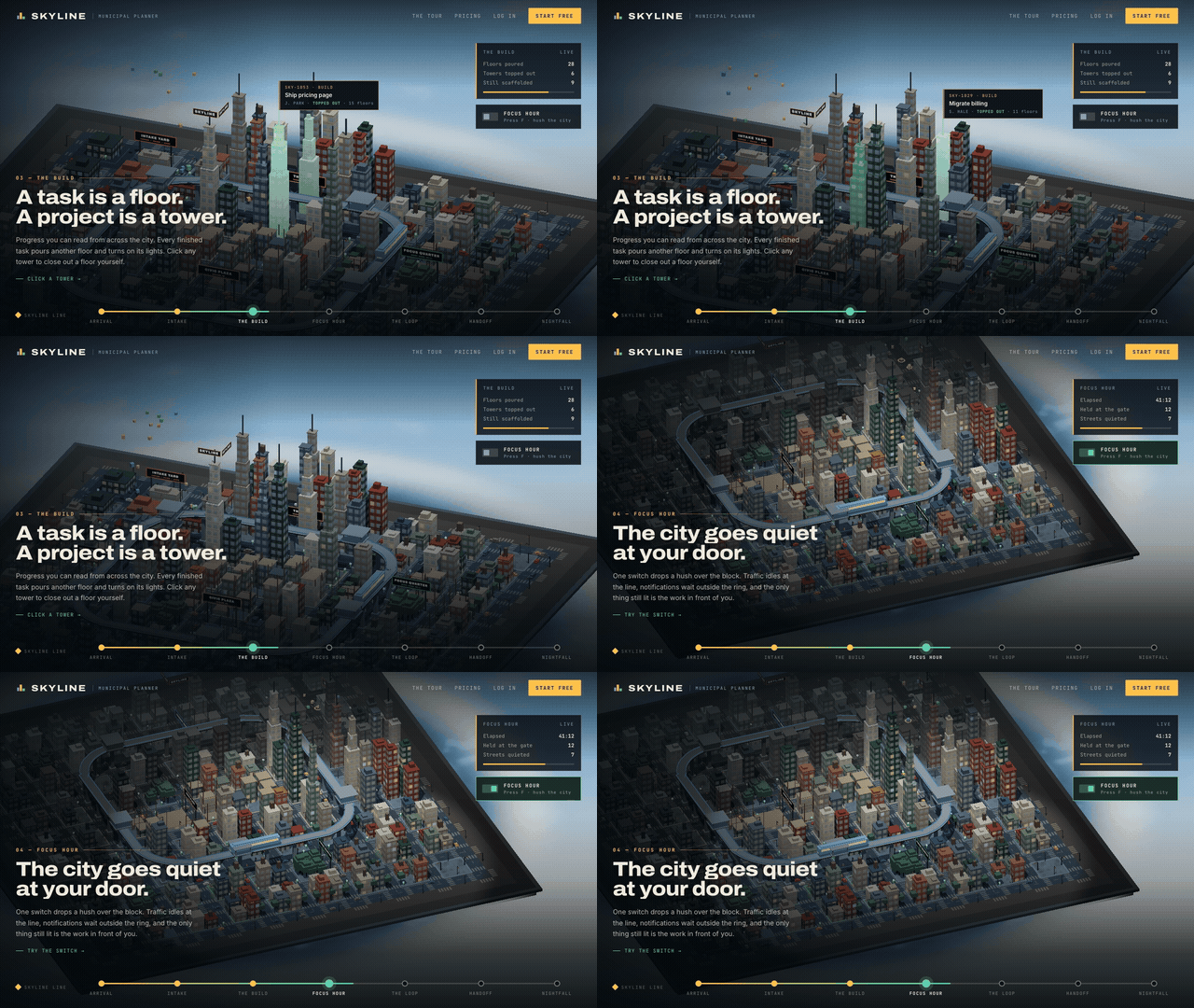
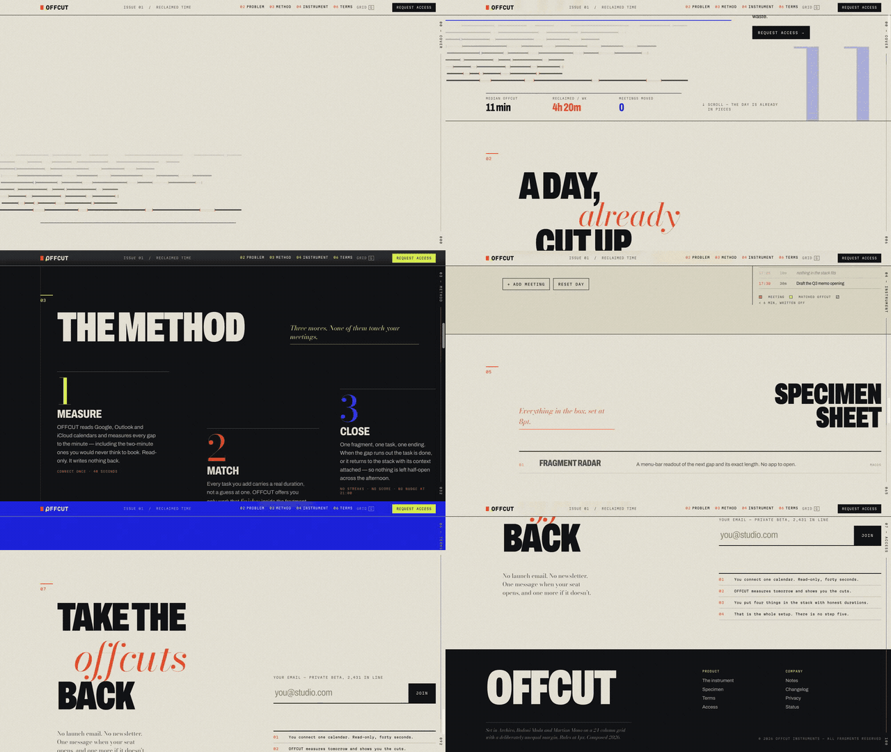
“Build me a landing page for my productivity app, with a radically asymmetric layout, dissonant colors and typography, and uncomfortable negative space. Break all the rules but still make it look good.”
Of course, the hard part is coming up with original ideas to ask for. AI can help with this too, but if you simply ask it for ideas, you’ll get the same average ones everyone else gets. Here’s a system I use to find unique prompt ideas with AI:
1. Ask AI to list a bunch of ideas, intentionally lacking detail. The goal is just to inspire your imagination.
I want to come up with a bold, unique design language for my product. Can you list as many ideas as you can, with short, high-level descriptions? Go broad, not deep.
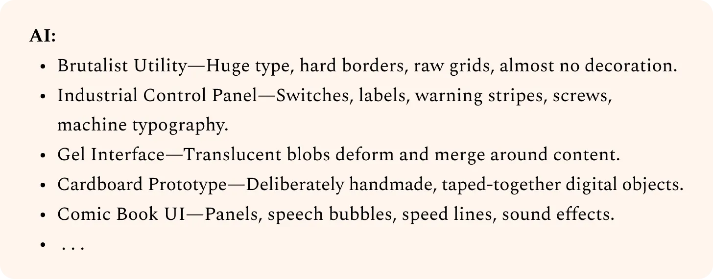
2. Visualize your favorites and note how you react to different directions. Then ask AI to refine them.
Industrial Control Panel:
I’m imagining something tactile. Clicky, satisfying buttons, nice sounds.
Initially I pictured something cartoony or skeuomorphic, but this feels tacky to me. Avoid that.
Instead, want consistent components and little touches that land this look without going overboard.
Gray gradients would look boring. Need more texture. Maybe we can incorporate some color, while retaining the control panel feel?
Can you sharpen this one based on my tastes?
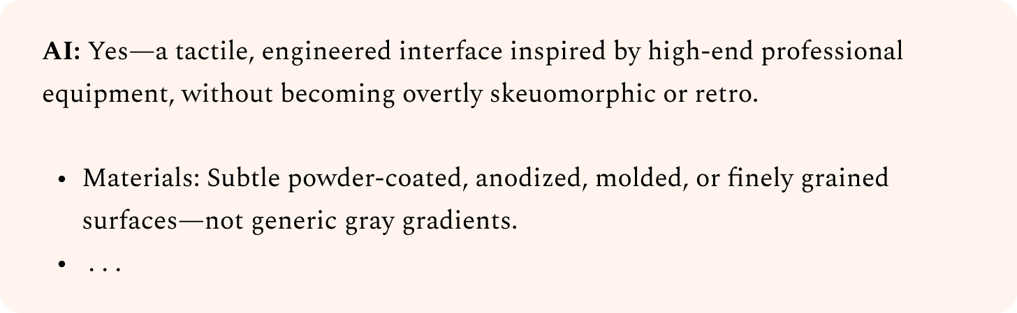
3. Iterate until you’re satisfied, then ask AI to write the prompt to build it.
Can you write a concise prompt that an AI agent could use to build an initial POC page with this?
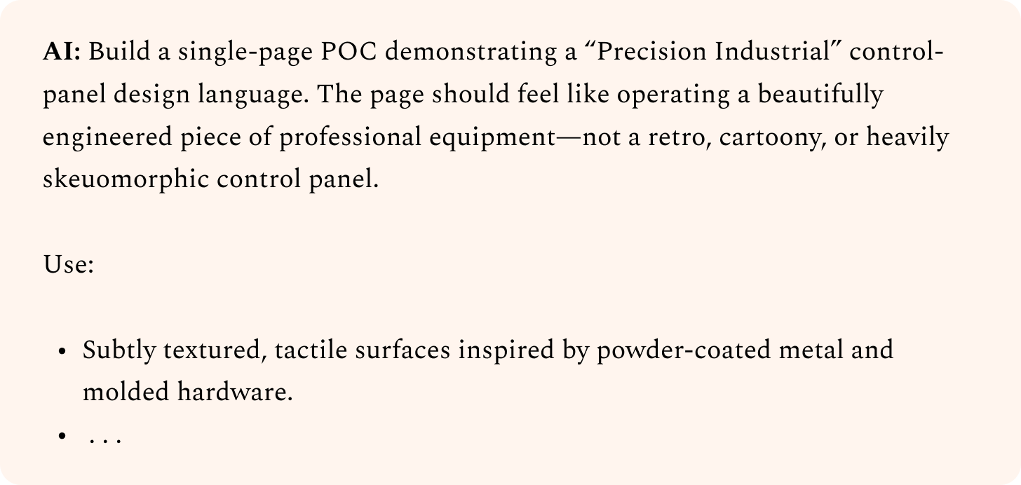
If you just paste AI-generated ideas back into AI, it’s hard to get something unique. After all, anyone else could have done the same thing. However, when you actively steer the design direction, you end up with something only you could have created.
Don’t be afraid to try ideas that sound terrible. If you find yourself thinking, “There’s no way this will work,” you’re on the right track. Often, your agent will surprise you, and you’ll realize you were underestimating it. If not, just throw away those results and try something else. But save the prompts that don’t work, and test them again when newer models come out. That way, you’ll know you’re taking full advantage of what the latest models can do.
Define: Deepen your design direction
So far, we’ve looked at how to explore a broad set of ideas and hopefully land on a promising initial design. No matter how we prompt, though, our initial AI-generated designs will usually still feel generic.
For example, look at the designs we came up with using seed strings:
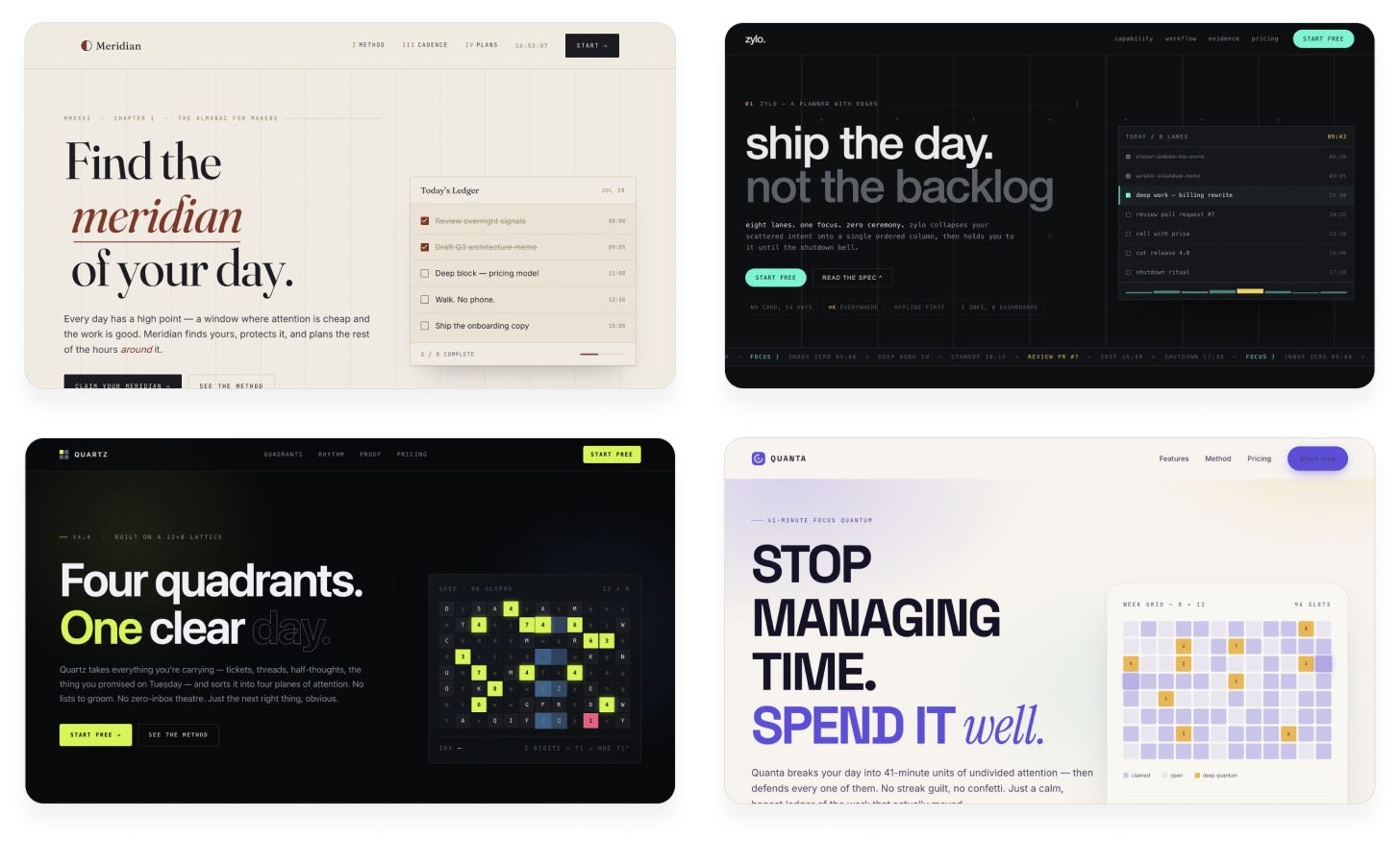
These have promise, but they’re still relying heavily on the same stale patterns: text on the left with a CTA button below, nav bar up top, graphic on the right.
Our next goal is to give each design an individual personality through distinct design choices. Below are my favorite techniques to do that.
Technique 3: Create positive feedback loops with subagents
We need to iterate on our designs to improve them. But simply asking our agent to look at the design and improve it won’t work, because the agent isn’t objective: it reviews its own code, past decisions, and previous rationale. AI can’t easily zoom out, look at the big picture, and “think different.”
To solve this, instead of letting the coding agent decide when the design is good enough, have it ask another agent—a “design critic.” The critic’s job is to look at screenshots of the current design and provide feedback. It doesn’t care how the current design is implemented or how much effort went into it, only if it actually hits the quality bar.
This approach has an extra benefit: we can use a big, expensive model for the critic without breaking the bank, because we’ll only use it for executive decisions. A cheap, fast model can do the grunt work, while the strong critic model provides taste.
Let’s try this on our previous designs, using Claude Fable 5 as the critic:
Prompt:
I want you to improve this design. To figure out what to focus on, use a Fable 5 subagent as a design critic.
Follow this procedure at each iteration:
Capture a screenshot of the current design
Invoke the critic in a fresh context, with just the screenshot, not the code, implementation details, or earlier iterations/critiques
Ask it to evaluate the aesthetic that the design is going for, imagine how a top design studio would execute this aesthetic, then outline the biggest gaps
Lastly, it should provide a score out of 10 indicating how close the current design is to that studio-level quality bar
Provide this guidance to the critic in its prompt:
It should think high-level about the overall structure and composition as well as look at the fine details
It should watch out for patterns that feel overdone, excessive, or otherwise obviously AI-generated, and penalize them
It should provide tight, specific feedback, not vague prose
It should be bold and opinionated, not rely on what’s safe or easy
Your work is only complete when the critic independently deems it 9/10 or higher. Do not put that criterion in the critic prompt; keep it objective in its scoring. Use the same critic prompt each time.
Claude Opus 5:
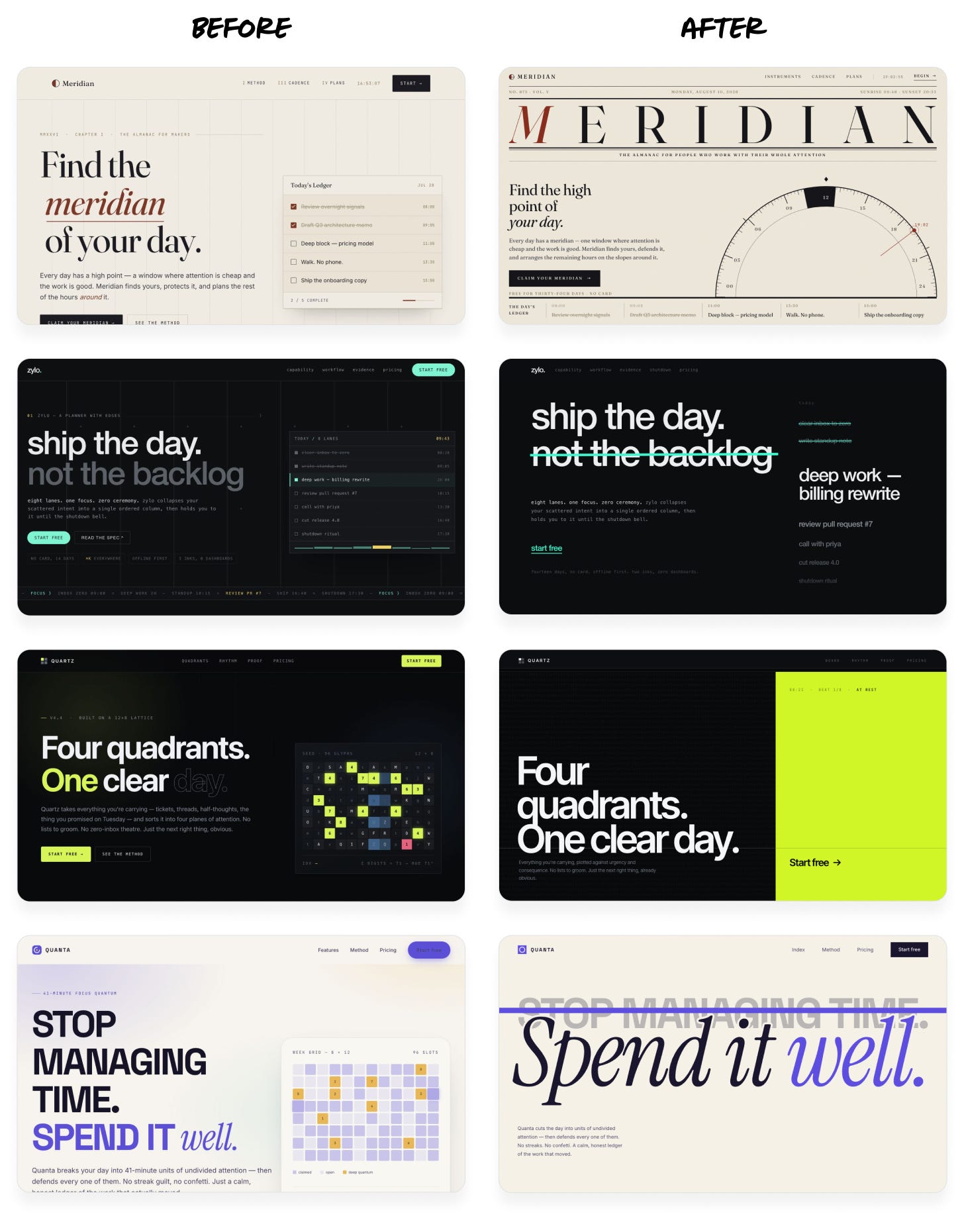
Instead of the same cookie-cutter layout over and over, each design now has its own identity—but still maintains its original high-level aesthetic.
Notably, in each case, Fable accounted for less than 10% of output tokens. Asking Fable to redesign the page directly would have cost twice as much and taken much longer.
The way you set these loops up matters a lot. Here are some tips:
Make sure the criteria for the critic are as clear and objective as possible.
Bad: “Judge if our design looks beautiful, not AI-generated.” This is too subjective, and the results will vary wildly from run to run.
OK: “Review the aesthetic we’re going for, visualize how a top design studio would execute it, then judge our design’s quality against that bar.” The prompt is still mushy, but it provides a consistent framework and quality bar.
Great: “Here are 5 designs: 4 professional examples and 1 screenshot of our product. Rank them by polish and taste level.” This instruction is concrete and objective, and gives a visual baseline for judgment.
Provide example images to demonstrate the target quality bar. You can use comparable screenshots or designs you like, or even AI-generated concept art. Instruct the critic to treat these as a baseline or a moodboard, not a target. You don’t want it to copy other designs outright.
Set the stopping criteria carefully. Otherwise, the critic may never consider the design good enough, and your agent will helplessly burn tokens trying to please it. Prompt it to do one or two iterations first, and see if it’s converging before adding more.
Choose the right model for each job. Consider bigger models for the critic role, since more parameters generally translate to better design sense and a wider distribution of ideas. Small models can be effective as the implementer, but don’t go too small. You still need a model that’s capable of executing a design direction well.
Technique 4: Use image generation to enrich designs
Coding agents love to write code, but they usually don’t incorporate images. Instead, they tend to use the easy code-based alternatives: gradients, shapes, and basic patterns. Those are all strong giveaways of an AI-generated design.
Some agents have image tools built in, but they underutilize them. Others don’t have image tools out of the box but can easily use the OpenAI or Gemini APIs to generate images with an API key.
Let’s try this on the designs from the last step:
Prompt:
The design is pretty plain. Add more personality using image generation. Consider shaders or 3D effects in combination with images to create more interesting visuals.
For image generation, use this OpenAI API key (only use it locally, do not store it in the code or product): sk-a1b2c3d4…
Verify that your work looks right frame-by-frame in the browser.
Claude Opus 5 (before and after):
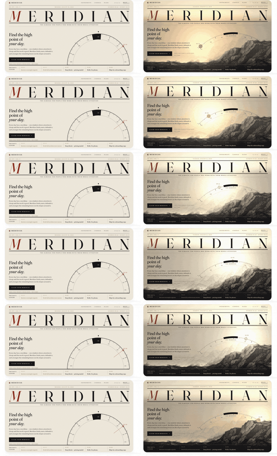
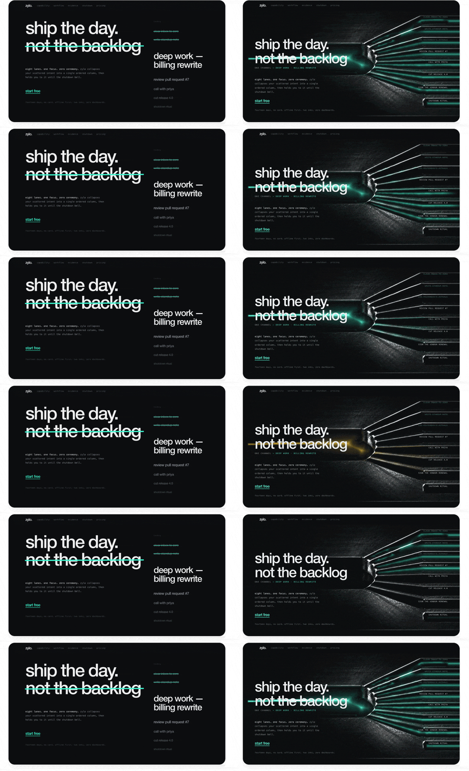
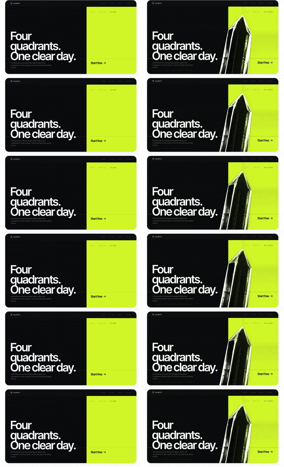
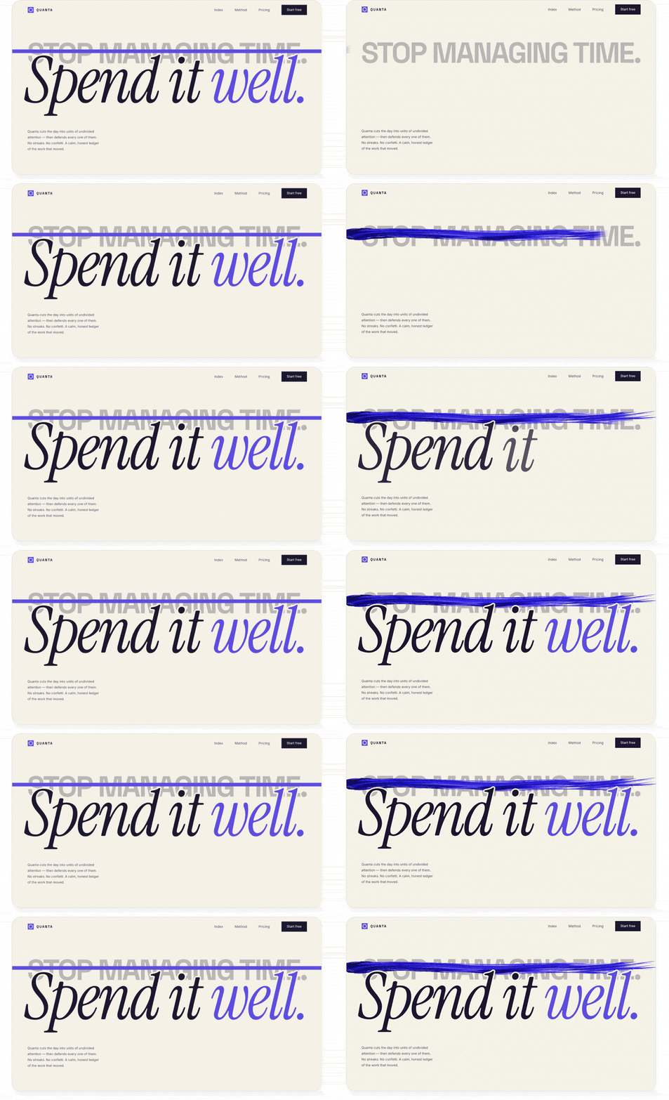
Images and effects like these can quickly add a lot of personality and make a design less obviously AI-generated, since they demonstrate more than surface-level effort.
Depending on your setup, there are different ways to connect your agent to image generation tools:
If you use Codex, Antigravity, or Grok Build:
Tell your agent to use its built-in image generation. The agent already knows how to do this but rarely does so until instructed.
If you use Claude Code or another agent but also have a ChatGPT subscription:
Tell your agent, “Use the Codex CLI to generate images. Help me install it if it isn’t already present. Make sure it’s billing my subscription, not an API key.” This lets you use your ChatGPT subscription for image generation without extra costs.
If you only use Claude, or any other tool:
The simplest path is to give your agent an OpenAI or Gemini API key to generate images. I recommend creating a separate API key with a tight spend limit, just for your agent. That way, your costs are controlled even if the key gets out or the agent misuses it, and you can easily revoke the key without disrupting other work.
If you find yourself pasting keys into chats frequently, put them in a file instead, and point your agent to it in your project. Tell your agent: “Create a gitignored file called .env.agents, store this API key in it, and note to yourself in AGENTS.md/CLAUDE.md that these keys are for you to use during development (but must not ship with the product).”
Technique 5: For more advanced motion, use video generation
Video generation models are incredibly powerful these days, but most people think of them as tools for generating UGC ads or clips of Will Smith eating spaghetti. They can work wonders for everyday design work too.
There are many video models out there, and the best ones change frequently, so I like to use an aggregator platform like fal.ai. This way, we can give our agent a single API key and let it evaluate different options and choose the best one without needing multiple integrations.
Here are two ways I love to use video models in my designs:
Create stunning animated graphics
The trick is to generate a looping clip with a solid color background, then either chroma key it out (like a green screen) or, in more complex cases, use a video matting model to remove the background. This gives you an animation that you can layer anywhere in your UI without it looking like a video.
For example, I took one of our previous designs and ran this prompt:
Prompt:
Can you replace the image on this page with a looping video clip that does something more interesting? Have the crystal splinter apart and slowly spin around. It should have awesome glassy effects that refract the page background and cast shadows and light around it.
To get convincing glass refraction effects, render the video of the glass over the page background colors first (so it bakes in the refraction effects), then remove the background with a video matting model.
Use this fal.ai API key: sk-a1b2c3d4…
Find appropriate recent models for video generation and background removal.
GPT-5.6 Sol (before and after):
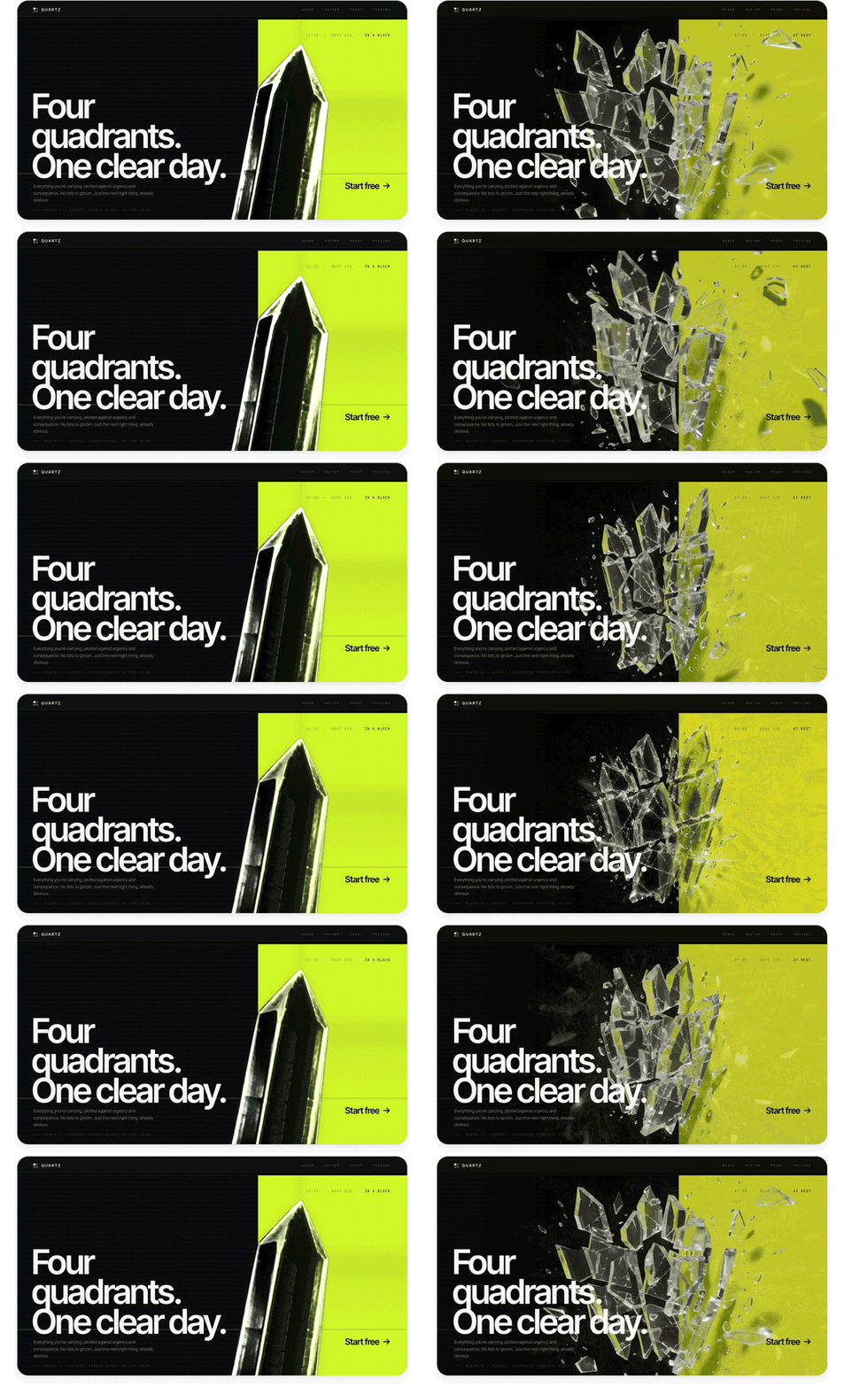
This is a much richer effect than you can get with code: interesting caustic reflections, glassy refraction effects, and complex physical motion.
Create fluid transitions between states
This is a really underrated use case for video models. In addition to generating video from text, many video models can interpolate between keyframe images. This lets you take two product stills and create a transition clip between them. You can play the clip when the user takes an action (like navigating to another screen of your app) or scrub through it frame-by-frame in response to a gesture (like scrolling or swiping).
Here’s a demo page showing off a scroll effect. I built it with a single prompt using GPT-5.6 Sol in Codex:
Prompt:
Build a demo page for a suitcase that uses a video model to create interactive transitions between a couple of screens. Each screen should show the suitcase in a different state, with vertical motion that feels appropriate for scrolling:
Initially, have the suitcase floating high up in the air
Then have it land on the floor and pop open
Finally, have its contents neatly land into it from the top
Generate the initial frame using your image generation skill. Then, generate a video clip that starts from that frame and animates to the next state. Use the final frame of that video to seed the next transition so that it continues seamlessly. Scrub through the transitions one by one as the user scrolls.
Use this fal.ai API key: sk-a1b2c3d4…
Use a video model with strong physics and consistency, like Seedance 2.5.
GPT-5.6 Sol:
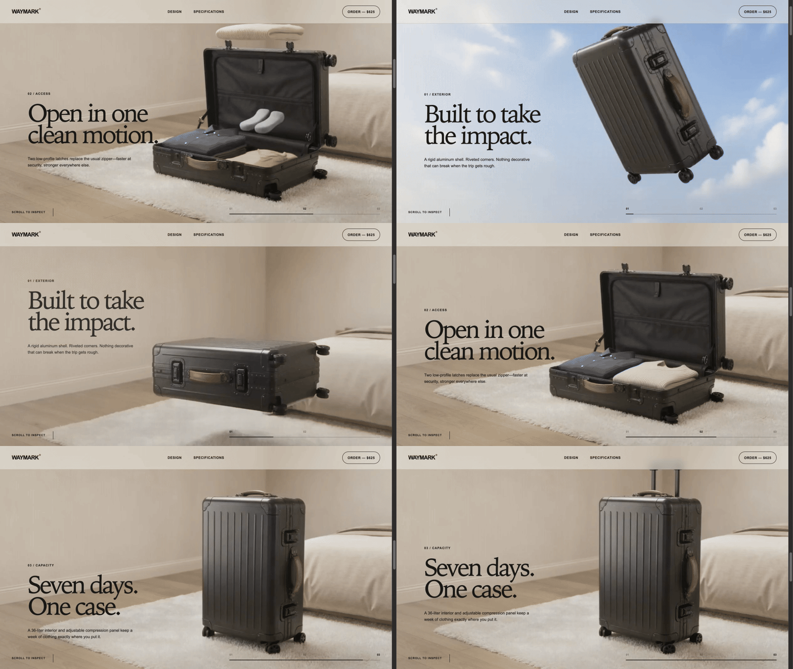
The transitions between pages scrub fluidly with the user’s scrolling and are fun to play with. Design like this makes the user want to keep scrolling and reading more about your product. And it only took one prompt!
Deliver: Polish your design into something users will love
Once we’ve gotten to a unique, standout design, the final step is to clean up the details and get it ready for production use. AI can build amazing, striking visuals, but your judgment will be key to making sure the design makes sense, flows well, and serves its practical purpose for your users.
Technique 6: Cut out elements that don’t add value
AI loves to add more, but it rarely takes away. One of the biggest signs that a design is AI-generated is that it overexplains everything or contains elements that don’t serve any practical purpose. By contrast, a design that exercises restraint immediately looks premium and tasteful.
When polishing AI designs, most of my effort goes into removing things. For example, when I was building my calorie tracking app, this was my initial design from Claude:
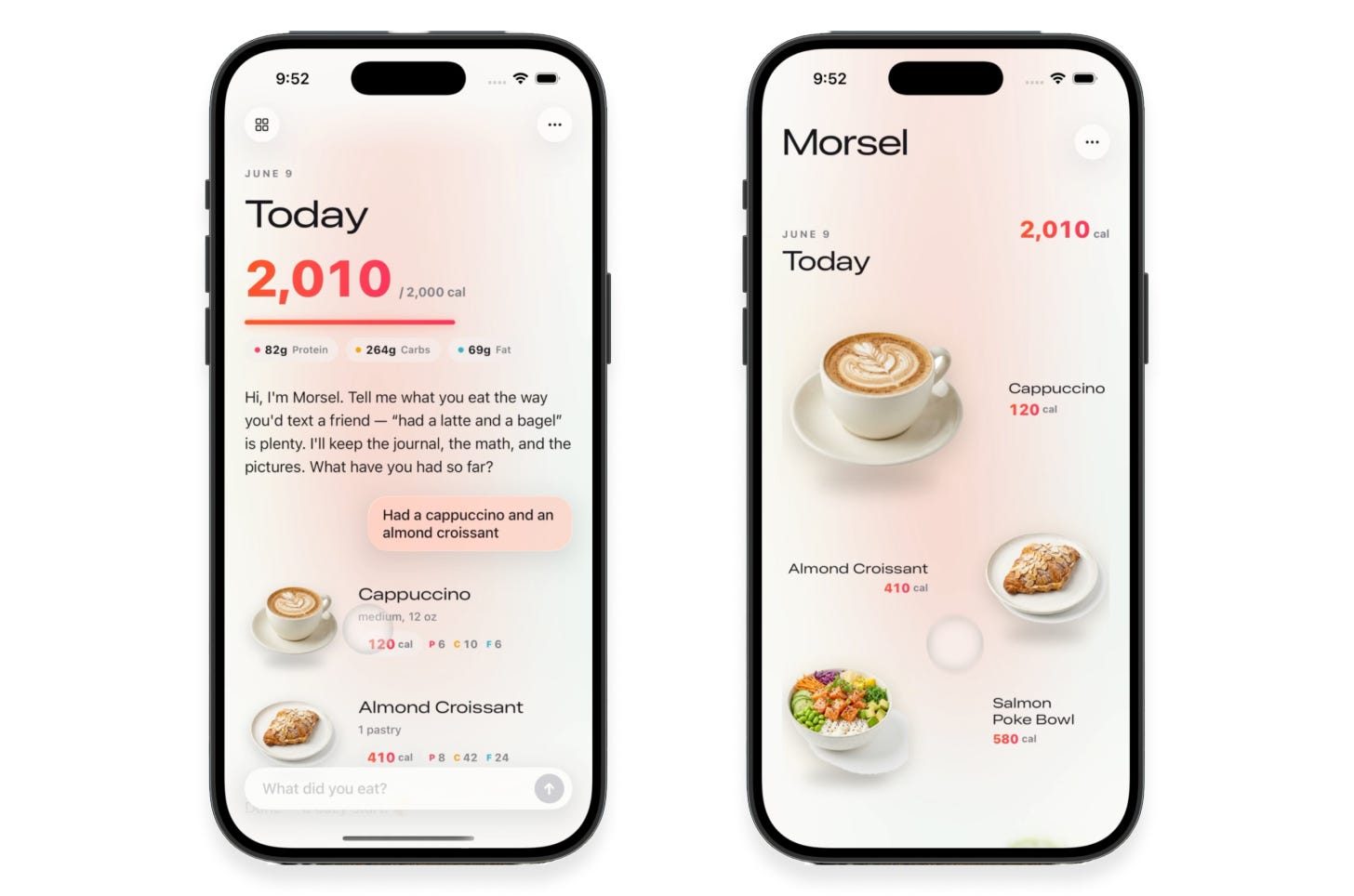
I’d described the app’s functionality and specifically asked for a “clean, minimalist design.” The results weren’t bad, and were certainly impressive for being fully AI-generated. However, despite my asking for minimalism, a lot in the design wasn’t adding value:
Pink glowy effects in the background and on the progress bar
Random colors and highlights on text
Extra labels and empty space when displaying all the foods for a day, when the images already communicate this
Custom buttons and text fields that look worse than built-in iOS components
I asked Claude to dial things back:
Simplify the layout into an image-centric grid
Get rid of gradients, glows, and unnecessary containers
Aim for a truly minimalist aesthetic that feels Apple-native
This was the result:
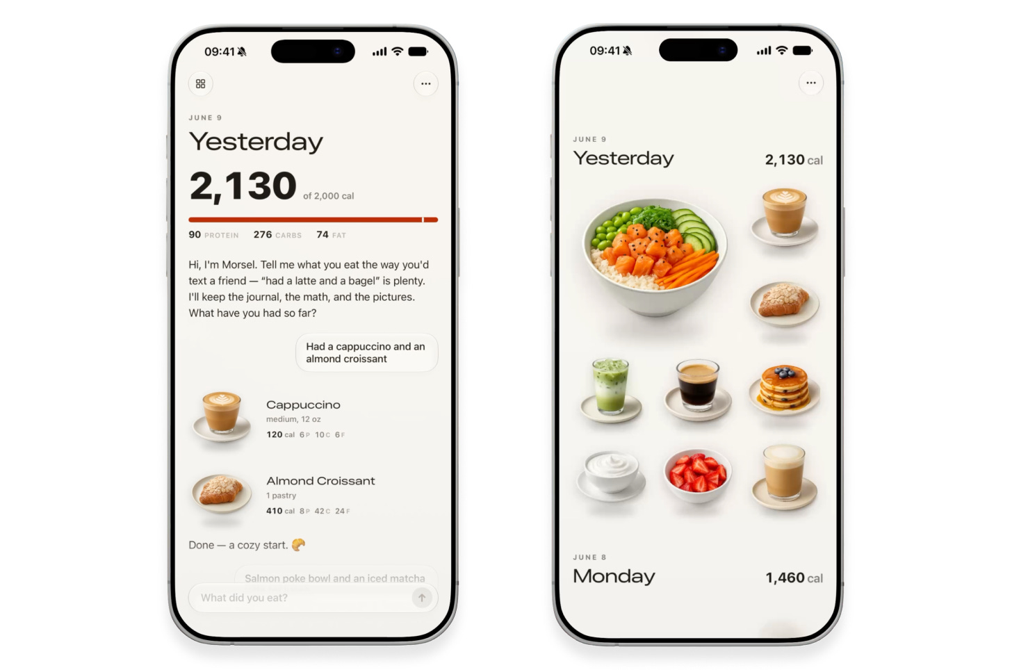
To my trained eye, the result is much better. It’s opinionated and allows the visuals to speak for themselves. It uses native iOS components, and the excessive colors and gradients are gone. The text is smaller, simpler, and tighter. This is good design.
Today’s AI models would never think to make these choices on their own. Remember, AI doesn’t like to take risks, and it’s risky to strip down a design and delete code. The model needs a push from you. Look over your design and ask yourself what really needs to be there. Often, putting less on the screen communicates more, because you can hold your users’ attention without overwhelming them with clutter.
