How to accelerate growth by focusing on the features you already have
Introducing the ARIA framework
👋 Hey, I’m Lenny and welcome to a 🔒 subscriber-only edition 🔒 of my weekly newsletter. Each week I tackle reader questions about building product, driving growth, and accelerating your career.
P.S. Check out my PM recruiting service (helping you hire Sr. PMs and VPs), Lennybot (an AI chatbot trained on my newsletter posts, podcast interviews, and more), and my swag store (great gifts for your favorite PM, or yourself!).
Everyone gets excited about launching new features, but in my experience, most of a company’s growth comes from the less glamorous stuff: incremental and consistent optimization of the core product. Of course, you need to add new features and business lines over time, but there’s a lot of hate for micro-optimization product work, and I’m here to tell you that this work is important—maybe the most important.
Every major tech company, including Facebook, Amazon, Netflix, Airbnb, LinkedIn, Uber, TikTok, and—as we’ve seen in recent newsletter issues—Duolingo, has long prioritized optimizing every square inch of their product. But surprisingly, I’ve never seen a great framework for how to think about this work. Until now.
Below, guest author Ken Rudin shares his home-grown ARIA framework. Ken’s background is bonkers: He was the first SVP of Products and Engineering at Salesforce, led the Growth and Analytics team at Zynga, was one of the earliest senior execs on the legendary growth team at Facebook, and went on to lead growth at Google (including leading growth for Google search, ads, cloud, and even their behavioral science work). Most recently, at ThoughtSpot (an AI-enabled analytics vendor) he helped transition their growth motion from a traditional sales-led B2B SaaS model to product-led growth. For more from Ken, make sure to follow him on LinkedIn.
Ask most product teams how they plan to drive more growth, and you’ll frequently hear the same answer: we need more features. More features will make the product more useful, which will lead to more engagement and retention, which will lead to more revenue. Or so the thinking goes.
But in my experience, you can drive significantly more growth by focusing on getting users to engage more with your existing key features and user flows. I realized just how effective it can be to focus on improving the engagement of existing key features when I joined Google in 2015 to lead their growth team. At that time, the average Google Search user in the U.S. did only 12 searches per month (which shocked me—I probably do 12 searches before getting out of bed every morning! 🤓). We wanted to encourage users to search more, because more searches = more opportunities to show ads = more revenue.
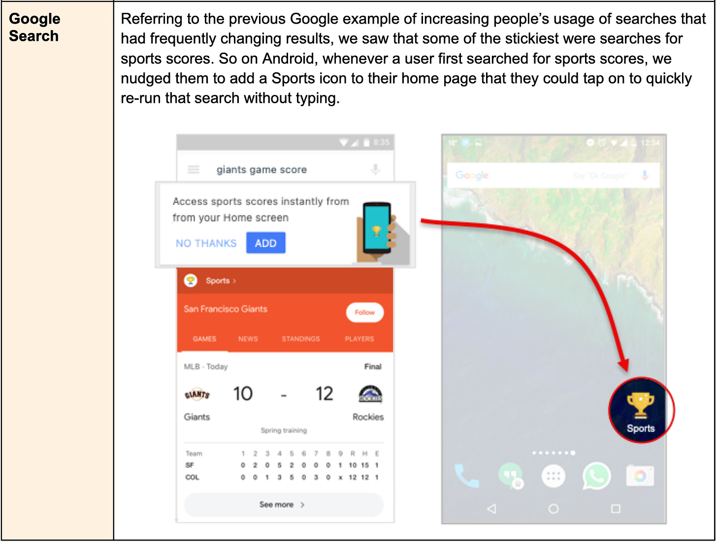
Our analysis showed that searches whose results changed frequently (e.g. sports scores, weather, or movie times) were the stickiest searches—users who did those searches would repeat them often. But only about 15% of users were aware of these types of searches. So rather than building new features, we focused on building ways to raise awareness and engagement with the searches we already had. We used several approaches (discussed in the sections below), which together nearly doubled the number of users who did these types of searches—and translated into millions of dollars of incremental ad revenue. 💰
Of course, you need new features to address changing user needs and compete in the market, but most product teams significantly over-index on building new features. Thus, my goal for this post is to provide a framework for (1) identifying key features to double down on and (2) increasing engagement with those features, which will drive overall product growth.
Why increasing engagement with existing key features is more impactful than launching new features
The most important features for a product are usually the ones that were built first. Once you get past a certain level of functionality, a lot of the new functionality on the roadmap often targets just a subset of users (e.g. power users) or supports use cases that are adjacent to the core use cases. So it’s a safer bet that you’ll drive more business impact by increasing engagement with a feature that has already been launched than one that’s still on the roadmap because it wasn’t critical enough to be prioritized.
Another reason to focus on existing features is that you probably have not squeezed the most utility for users, and therefore engagement, out of them yet. When you first release a feature, you’ll usually find that about 80% of the feature’s design works well but the other 20% doesn’t. Some users may get stuck on a step that they find confusing or takes significant effort, and don’t complete the flow, which means they actually get 0% of the feature’s value. For others, it means they use the feature less than they otherwise would, and therefore get less value. By focusing on improving that last 20%, you unlock the full 100% of the value for users.
I’ve applied the approach of focusing on increasing engagement with existing key features many, many times—with several Google products (including Search, YouTube, Google Cloud, and Google Ads), at ThoughtSpot (an analytics vendor I worked at, whose product allows you to analyze data using natural language and AI), and with several other venture-backed companies that I have the honor to advise. I can confidently say that product teams frequently, or even usually, drive more growth by optimizing engagement with existing key features than by launching new ones. And in an economic environment where engineering budgets and projects are being cut, getting more impact from work that’s already been done is even more critical.
If increasing engagement with existing key features frequently has more impact than adding new features, the next question is: How do we increase engagement in a structured, repeatable way?
The ARIA framework
Product teams have lots of frameworks leading up to launching new features, including identifying user needs, defining solutions, and prioritizing them on a roadmap. But what about a framework for increasing the adoption of features after they’ve launched? It’s one thing to know that you should focus on optimizing existing features but another to know which features to focus on, and what to do to make them more successful.
When I’ve looked for a framework for increasing engagement with existing features, I’ve always come up empty-handed. That’s what led me to create the ARIA framework.
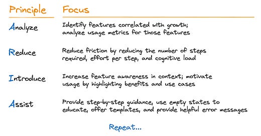
ARIA has four key principles: Analyze, Reduce, Introduce, and Assist:
This isn’t a one-and-done process, however. The intent is not to choose a feature, go through the four principles once, and then move on to the next feature. Instead, it’s meant to be an ongoing process—sort of like having an implicit Repeat principle as the last step of the framework (though changing the name to ARIAR just doesn’t sound as good. 😁)
ARIA is certainly not a complete list of everything you can do to increase feature adoption, and it would be a waste of time to create such a list anyway, because people are always innovating new ways to make features more engaging. Instead, use the framework as a cheat sheet to help guide you.
Principle #1: Analyze
First, you need to figure out which features to focus on. That means you need to analyze your data to identify which of your features are most correlated with growth, and then analyze the engagement levels of those features to highlight which features aren’t getting the user love they deserve.
1.1 Identify key features correlated with growth
As product people, our features are our creations. We’re proud of all of them, and we’d like to see them all thrive. (OK, I admit that I have a few that I’d like to forget about. 😬) But given that you always have limited resources, you need to identify your “key features”—that is, those features that have the highest correlation with acquisition, monetization, retention, or expansion. Increasing adoption of those features will have the biggest impact on growing your business. (You might be thinking, “But correlation doesn’t imply causation!” That’s true, but it’s still the best way to identify features with the highest likelihood of driving growth.)
A correlation analysis will tell you how strongly the use of a feature is related to the movement of your various growth metrics. There are many popular, easy-to-use tools (including some free ones) for quickly doing a correlation analysis, or you can even do it pretty easily in a spreadsheet. For a great primer on how to do correlation analysis, see this post in Lenny’s Newsletter by Olga Berezovsky: “How to do linear regression and correlation analysis.”
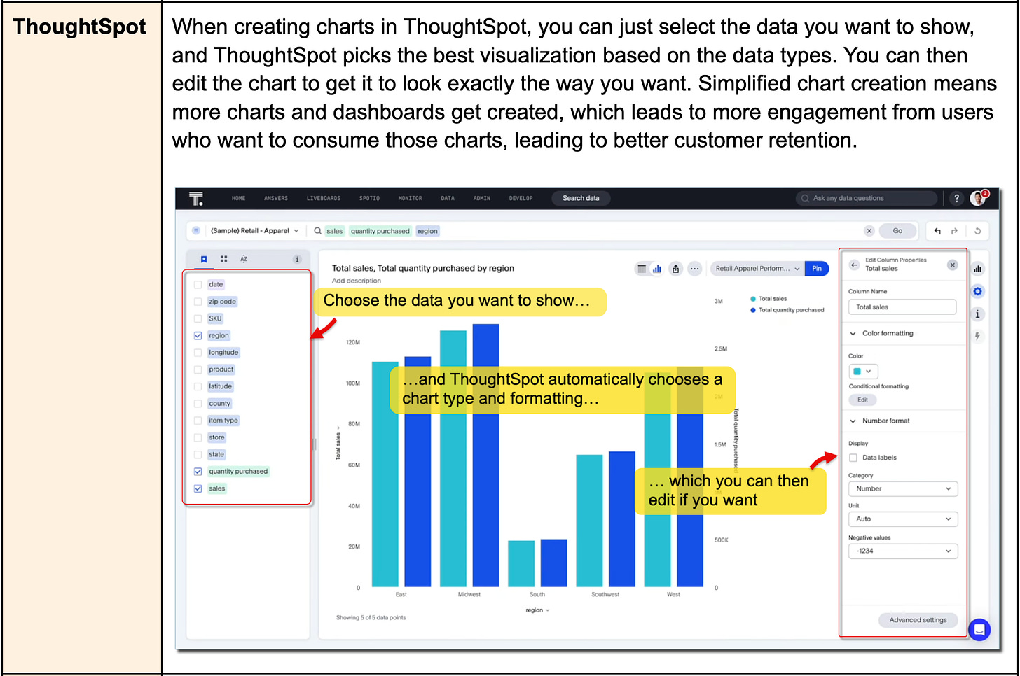
Examples of key features:
1.2 Calculate usage metrics for key features
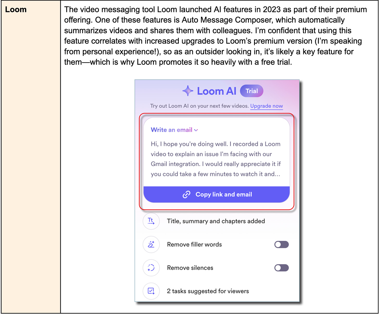
Once you’ve identified your set of key features, the next step is to gather data about their existing level of user adoption and engagement. For example, what percentage of YouTube users have subscribed to a channel, or what percentage of Loom users use the Auto Message Composer?
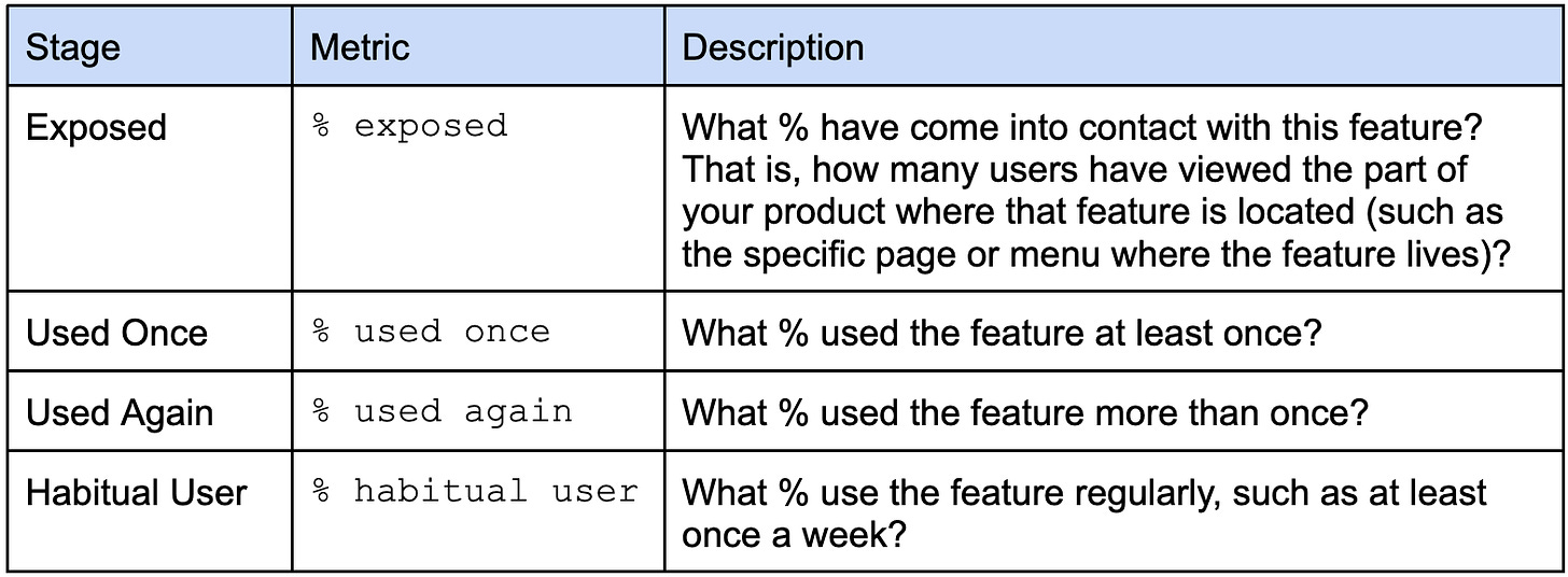
When analyzing usage, it’s helpful to look at the different stages of feature adoption:
If using the feature requires multiple steps (which is true for most features), then you also want to measure completion rates. For example, of the Gmail users who start the process of adding another email account (like a Microsoft Outlook account) to their current Gmail account, what percentage complete that process?
One final important metric to measure is success rate. This doesn’t apply to every feature, but many features have a concept of a successful outcome for the user. For instance, what percentage of resumes submitted for a job opening on Indeed receive a call back from the employer? Or what percentage of apartment searches on Apartments.com return at least one result that meets the user’s search criteria?
When I was an advisor to Roblox in their early days, many of our growth wins came from focusing on success rates. For example, our analysis showed that making frequent changes to your avatar was strongly correlated with user retention, particularly for new users. But we saw that about 20% of visits to the Avatar Shop were “unsuccessful”—users would leave the shop without changing their avatar. By adding the ability to sort clothing and accessories to show newest or best-selling items first, and adding simple search capabilities, we were able to increase the success rate of these Avatar Shop visits significantly, increasing the frequency of avatar changes, and ultimately increasing new-user retention by a couple percent. 🎯
Final tip: When analyzing these metrics, segment your users by how long they’ve been using your product (such as 0-30 days, 31-90 days, and 91+ days). This helps you see which features are adopted early in a user’s journey and which take more time.
1.3 Focus on features that drive growth and have low usage metrics
The final step in Analysis is simple: identify key features (i.e. features correlated with growth) that have low adoption, completion, or success rates. If something is already successfully used by a large percentage of users, then there’s not much room for improvement. Once you’ve identified which features to focus on, you then need to increase their engagement. Below, I cover the three most consistently effective ways that I’ve found for doing this.
Principle #2: Reduce
The first consistently effective way to increase engagement with a feature is by reducing the friction associated with using it. This includes reducing the number of steps, reducing the effort to complete each step, and reducing how much we need to learn before we can really use it (i.e. reducing the “cognitive load”).
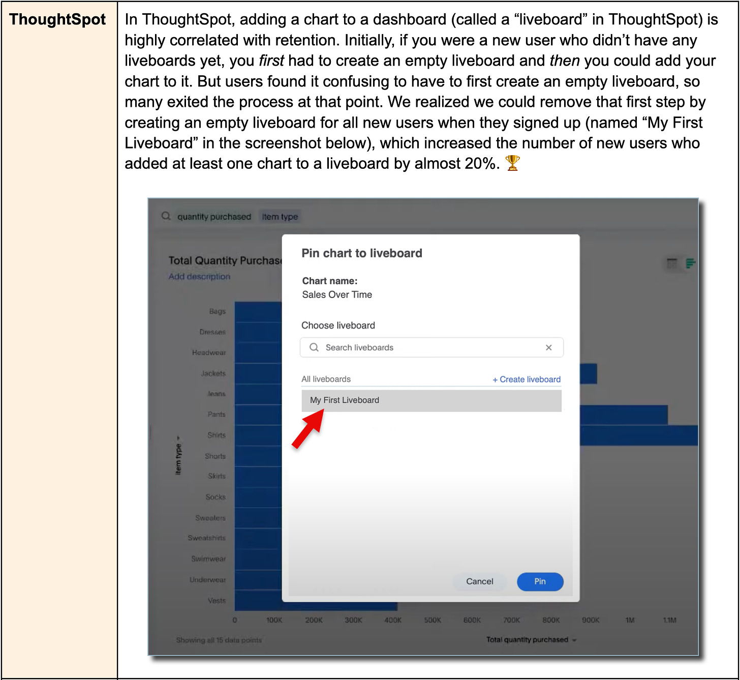
2.1 Reduce steps in the process
Most features have multiple steps. Every time you ask a user to click, tap, or type, even if it all happens in one screen, that’s a step. And when you start counting all these steps, you’ll realize that you’re asking your users to do a lot more than you realize. You need to look at whether some of the steps can be removed.
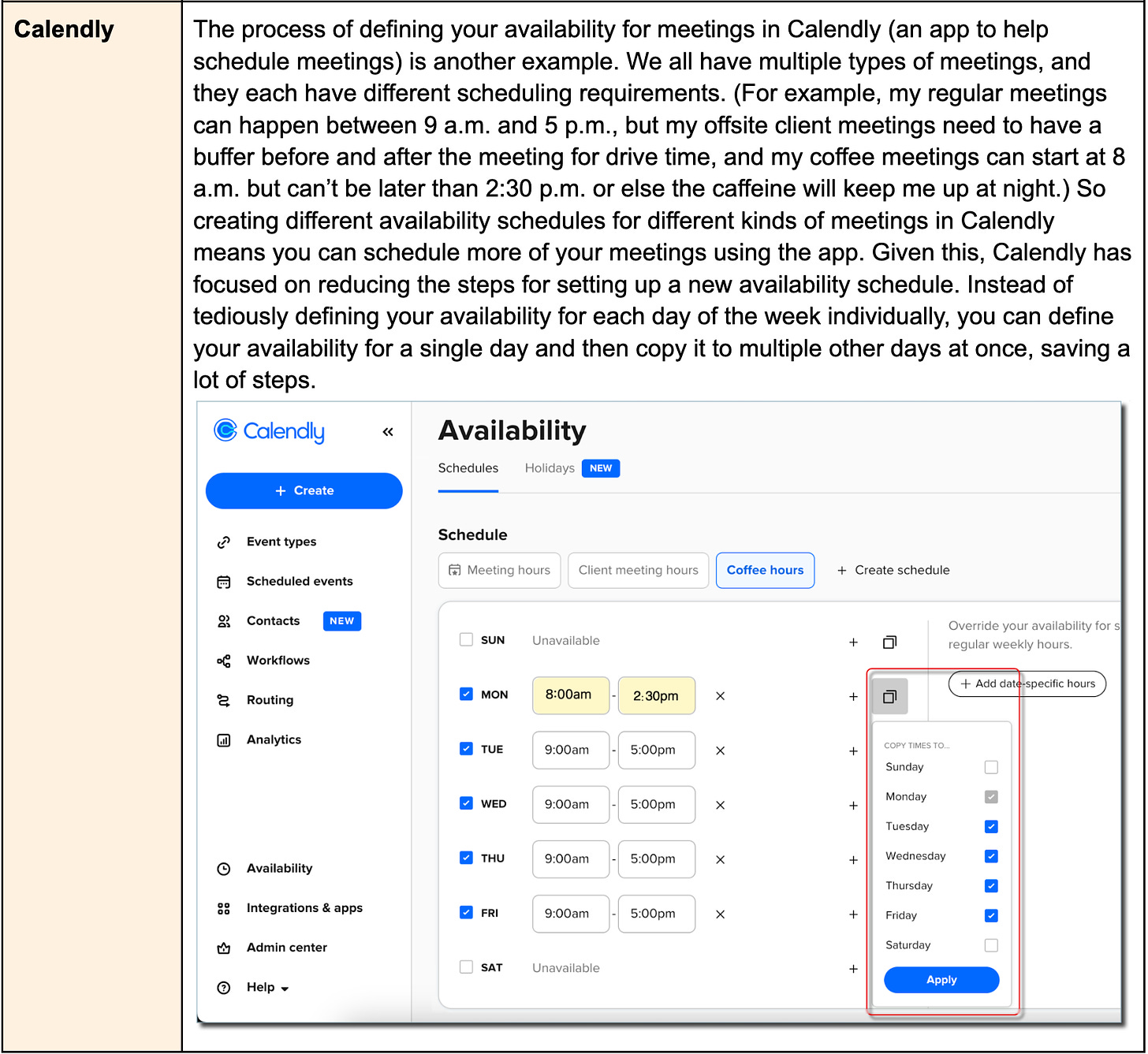
Examples of reducing steps in the process:
2.2 Reduce effort per step
Once you’ve minimized the steps needed to use a feature, look at the remaining steps and see if you can reduce the effort required for each step, i.e. make each step simpler. Product teams know they need to do this, but in my experience they rely on a limited number of approaches, such as optimizing the UI flow, mimicking how similar flows are built in other popular apps so the flow feels more familiar to users, and clarifying the verbiage in the app. But there are many other approaches. Below are three additional methods that I’ve found to be very effective and should be used much more often than they currently are.
a. Have users edit rather than create from scratch
You know how it’s usually easier to start with content that’s close to what you want and edit it than it is to create new content from scratch? That’s true for your users as well, which means that where possible, providing users with a good starting point for any kind of content creation can reduce friction and increase engagement. This “edit vs. create” idea applies to not just traditional text or image-based content but to anything the user needs to create or define.
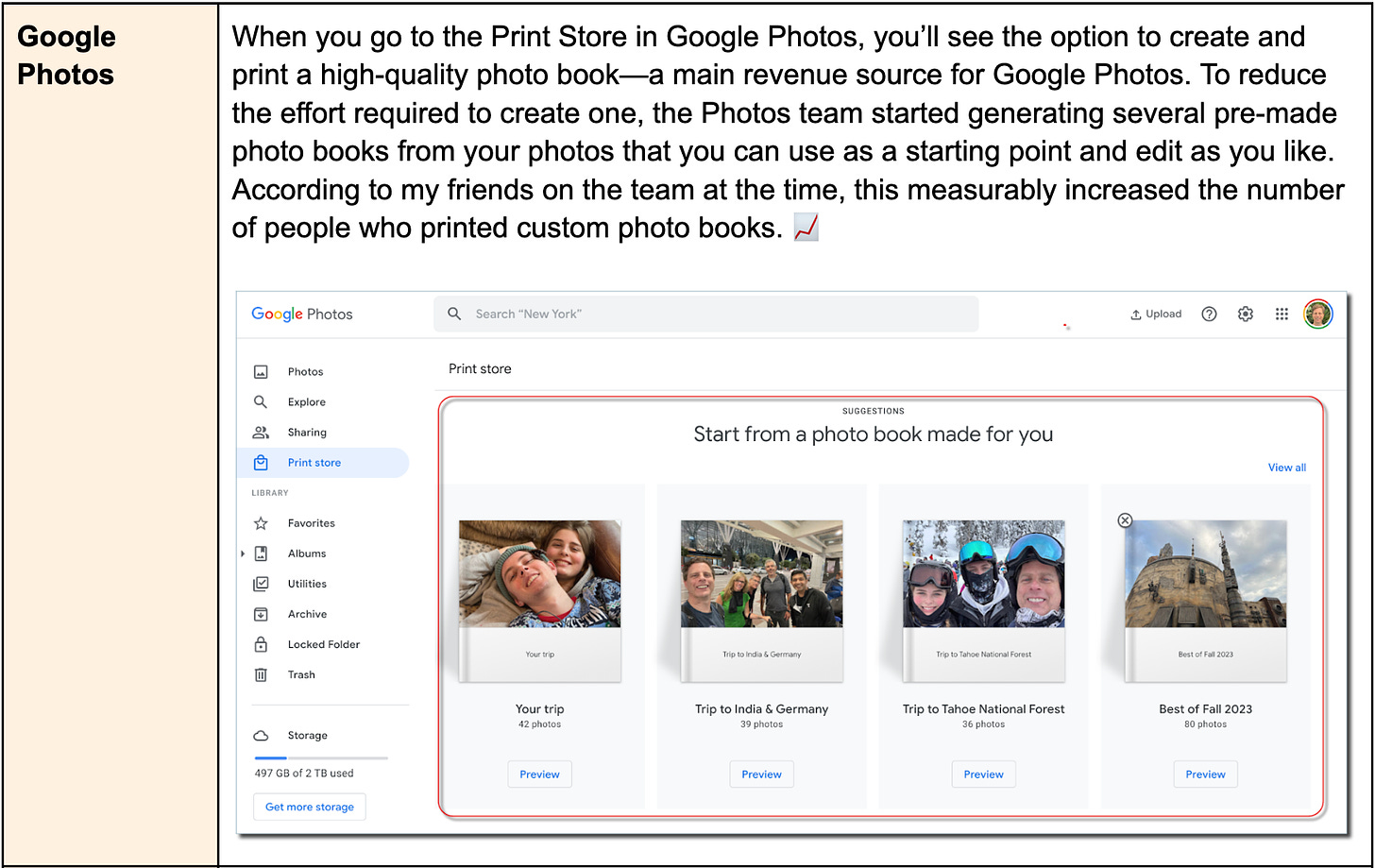
Examples of editing vs. creating from scratch:
b. Use smart defaults
Another way to reduce effort is to intelligently prefill default values.
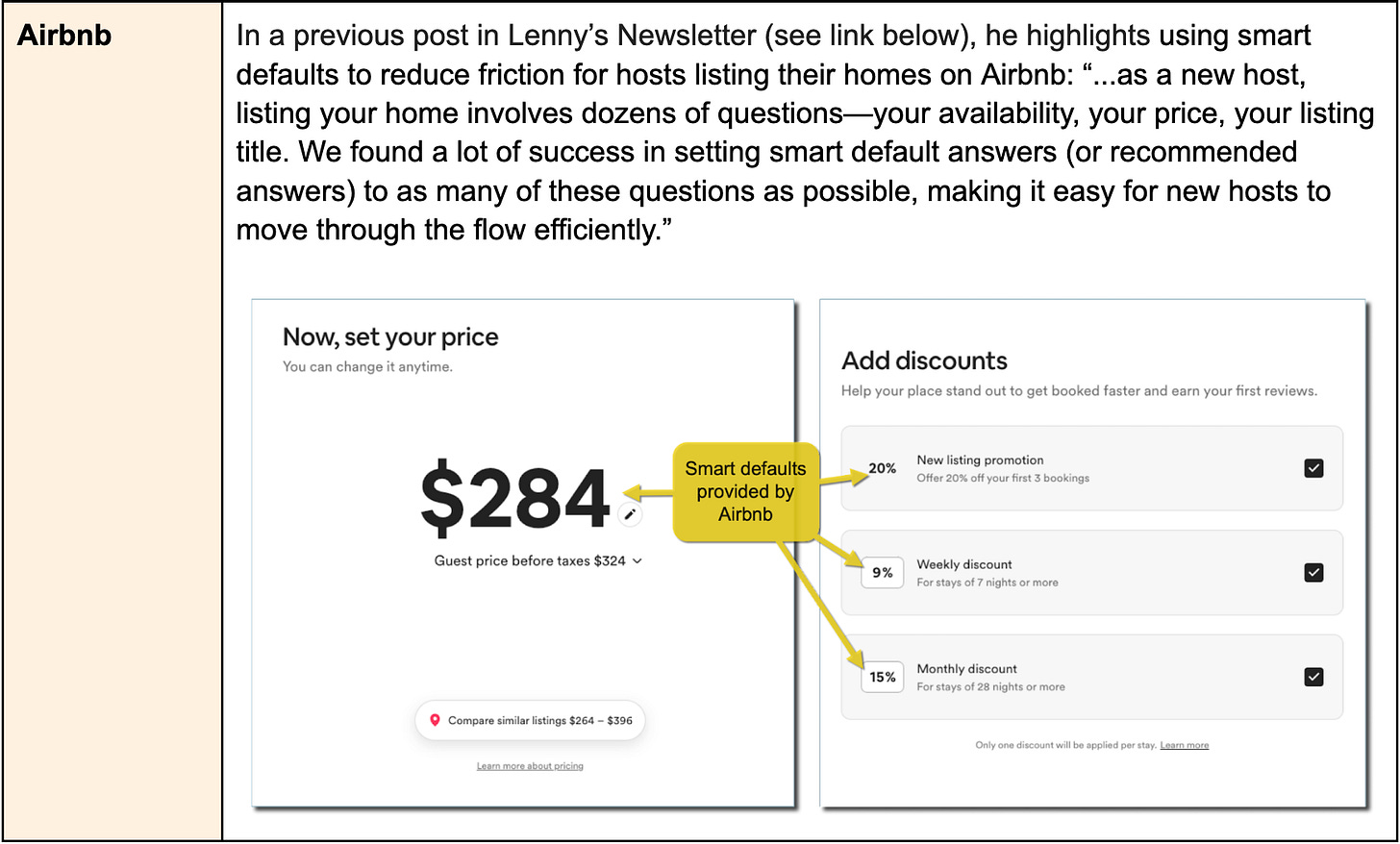
Examples of using smart defaults:
c. Enable users to click or tap rather than type
Asking the user to enter information by typing is an overlooked but very real source of friction. You need to know exactly what to type (for example, if you want to share a Figma file with someone, you need to know the correct email address to type), and you have to deal with typos. Also, this friction is magnified if the typing needs to be done on a small mobile screen. Instead, explore where you can have users select something from a list with a click/tap.
Examples of clicking or tapping vs. typing:
2.3 Reduce cognitive load
We can’t have a discussion about removing friction in your product without at least mentioning reducing cognitive friction, also known as cognitive load—that is, reducing the mental effort required to understand and use a feature. To find out which of your features users struggle with, you need to grab a few new users and watch them try those features for the first time. These sessions are often painful to watch, but you’ll learn a ton.
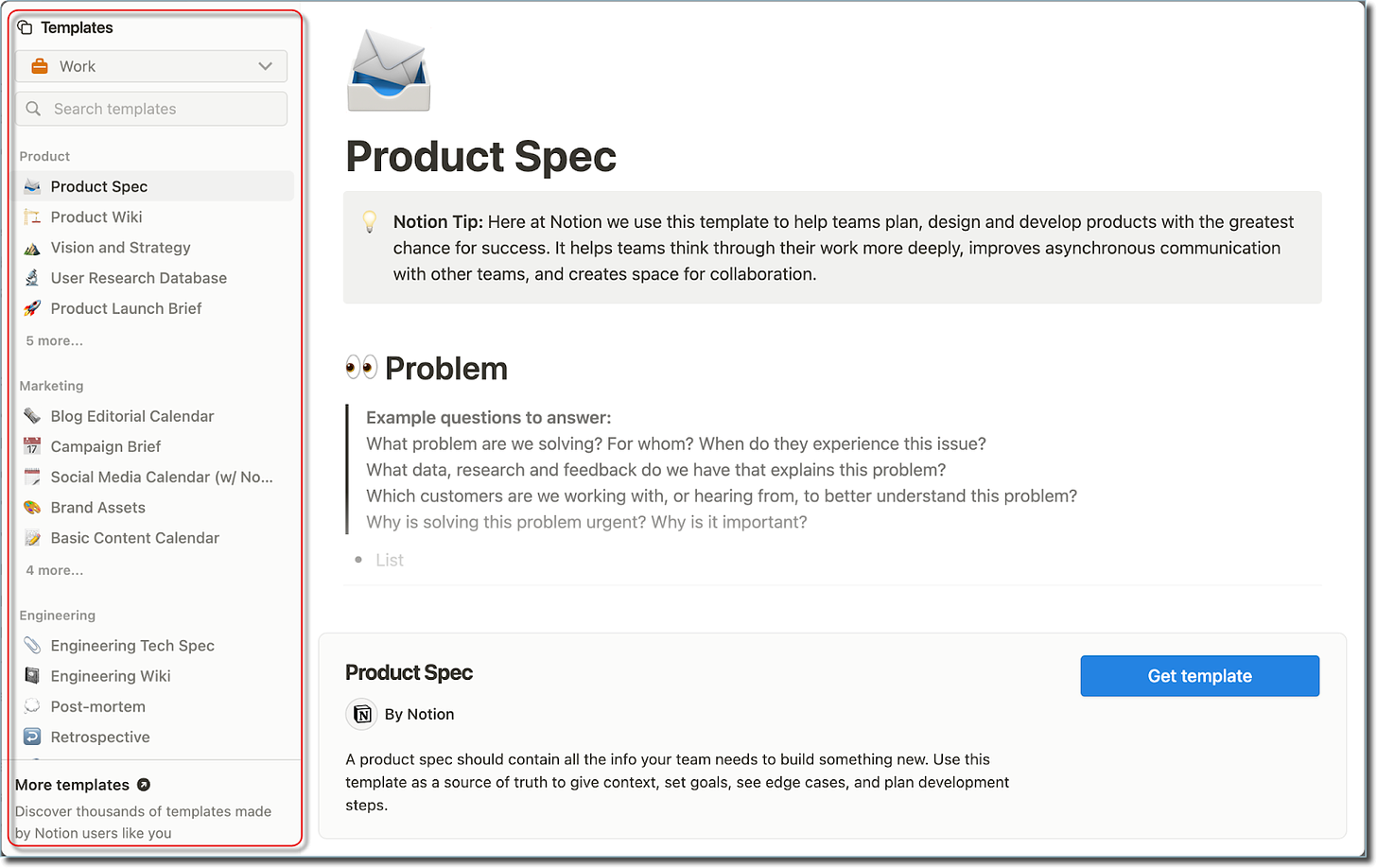
You’ll uncover which concepts in your product are unfamiliar to your users. For example, I love Notion as an all-purpose note-taking and productivity tool, but I know several people who tried to switch from Evernote to Notion and had trouble getting their head around Notion’s central concepts of “blocks” and “databases.” A big part of Notion’s success (and that of other companies like Figma and Airtable) is due to their heavy investment in building templates that introduce users to core concepts by showing them in action, making them less conceptual and more tangible. (I discuss templates more in the Assist section below.) Notion created over 150 templates for different use cases, and users can also create and publicly share their own—see screenshot below. If it’s absolutely necessary to introduce your users to unfamiliar concepts, be prepared to spend a fair bit of time and resources finding ways to help people easily understand them.
Principle #3: Introduce
Reducing the friction associated with features is critical, but it only solves part of the problem. It doesn’t matter much that you’ve been able to reduce the number of steps required, the effort per step, or the cognitive load if no one knows about the feature.
In this section, we’ll talk about how to increase users’ awareness of a feature and motivate them to use it. A key point here is that I’m not just talking about introducing newly launched features. I’m referring to all your key features. Many of your existing users don’t know about all of them, and for your new users, every feature is new to them.
3.1 Increase feature awareness, in context
The first step to introducing a feature is to simply increase users’ awareness of the feature. We’ve all seen the common UI elements used for this: pop-up modals, tooltips, banners, pulsing hotspots, walk-throughs, checklists, etc. But the key question we should ask isn’t how we should raise awareness but when.
Product teams often rely on the new-user onboarding flow to introduce key features, but there’s a limit to how much functionality you can show a new user before you overwhelm them. Or they rely on What’s New pop-ups, but their effectiveness is questionable. (I’m sure I’m not the only one who reflexively closes these pop-ups without reading them. Particularly when they take over my entire screen, blocking me from my games! 🎮 )
Fortunately, there’s a better way. The right time to introduce a feature is to introduce it in context, which means at a point when the user is most likely to want to use it. Compared with a user who is simply told about a feature, a user who is told about a feature when they need it is much more likely to use that feature and remember it.
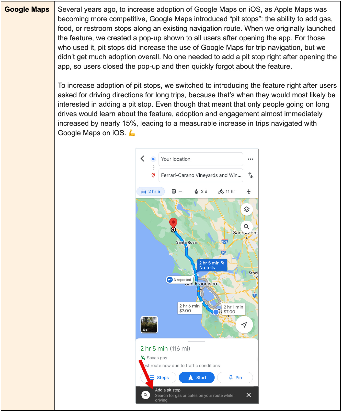
Examples of increasing feature awareness in context:


